




Red, blue, yellow, black straight lines and white space.
Many people think of Piet Mondrian the moment they see this combination.
At first glance, Mondrian’s works look very simple. Yet behind them lies a long history of searching through nature, the city and spirituality for “universal beauty.”

Last updated: October 21, 2026
Who was Piet Mondrian?
Piet Mondrian and Modern Abstract Art
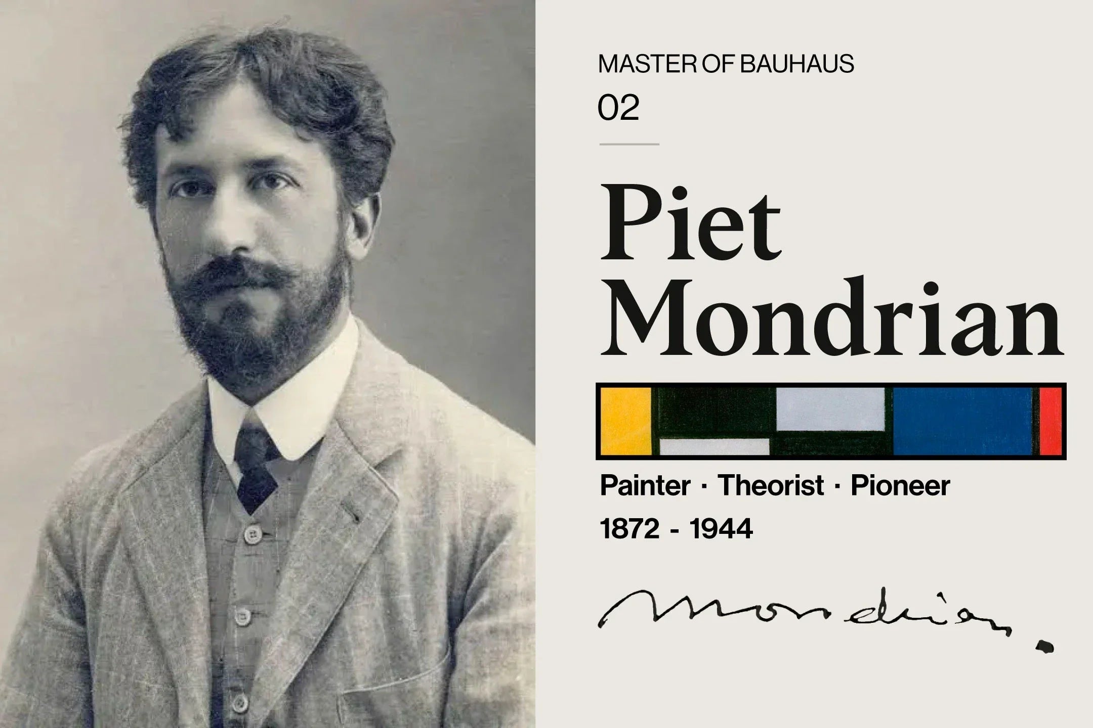
Piet Mondrian was a Dutch-born artist and one of the leading figures of 20th-century abstract painting.
His real name was Pieter Cornelis Mondriaan. Born in the Netherlands in 1872, he began his career with landscapes and naturalistic painting.
Today he is known for abstract compositions of black vertical and horizontal lines and the primary colors red, blue and yellow, but this was not his style from the start.
Influenced by many art movements, including Impressionism, Pointillism, Fauvism and Cubism, Mondrian’s work gradually changed from “painting what is seen” to “painting that expresses the essence.”
Piet Mondrian at a glance
Who was Piet Mondrian?
Piet Mondrian was a Dutch painter born in 1872. Early on he painted landscapes, trees, churches and countryside scenes, but influenced by Cubism and abstract art, he moved toward his own abstract expression.
With Theo van Doesburg and others, he was involved in the Dutch art movement De Stijl , and established the style later called “Neoplasticism.”
His work continues to have a major influence not only on painting but on architecture, furniture, graphic design, fashion and interior design.
Keywords for understanding Mondrian
- Piet Mondrian
- Mondrian
- De Stijl
- Neoplasticism
- The primary colors red, blue and yellow
- Vertical and horizontal lines
- Composition with Red, Blue and Yellow
Why are Mondrian’s works so simple?
A painter who moved from nature to abstraction
The key to understanding Mondrian’s work is that he did not paint only geometric abstraction from the start.
The early Mondrian painted real scenes: Dutch landscapes, trees, farms, riverbanks and churches. They show a strong interest in nature and an experimental approach to color and light.
But he gradually turned his attention away from “what is visible” itself, toward the structure, rhythm and balance behind it.
Even when painting a tree, for example, his focus shifted from the details of branches and trunk to the relationship between vertical and horizontal, the tension of lines and the balance of the whole picture.

What is De Stijl?
De Stijl and new rules of beauty
In 1917, the art movement De Stijl was born in the Netherlands. At its center were Theo van Doesburg, Piet Mondrian and a group of architects and designers.
De Stijl was a movement that sought to extend new rules of beauty beyond painting to architecture, furniture, graphic design and interiors: to all of life.
Its thinking was very clear: remove unnecessary ornament and strip color and form down to their most basic elements. In other words, it sought to create universal harmony with a limited set of elements: horizontal and vertical lines, the primary colors red, blue and yellow, and white, black and gray.
What is Neoplasticism?
Neo-Plasticism
Neoplasticism is the approach to abstract art Mondrian pursued. Rather than depicting natural forms or chance effects as they are, it sought to express a more universal beauty through basic elements: line, color and plane.
For Mondrian, red, blue and yellow were not just colorful decoration. They were the basic colors for bringing painting closer to its purest state.
What is Composition with Red, Blue and Yellow?
Mondrian’s signature work in red, blue and yellow
Composition with Red, Blue and Yellow is one of the signature compositions that made Mondrian’s name famous worldwide.
A white surface divided by black straight lines, with planes of red, blue and yellow placed within it. The work looks very simple at first glance, but the thickness of the lines, the amount of white space, the size of the color planes and the tension of the whole picture are finely tuned.
The large red plane has a strong presence, yet it is balanced by the blue at the lower left, the yellow at the lower right and the white space. The appeal of Mondrian’s work lies in this coexistence of “simplicity” and “precision.”


- Bauhaus Japan
Why Mondrian suits contemporary interiors
Art that gives rhythm to a simple room
Although created nearly 100 years ago, Mondrian’s works go remarkably well with contemporary interiors.
The reason is that their composition is so clear: white space, black lines and a few primary colors. With so few elements, they blend naturally into minimal rooms, Scandinavian-style spaces and modern offices alike.
At the same time, the red, blue and yellow planes keep a space from becoming monotonous, adding just the right accent and an intellectual atmosphere to a simple room.
Spaces that suit a Mondrian poster
- A living room with white walls
- A minimal workspace
- Scandinavian and modern interiors
- Rooms with Bauhaus or mid-century furniture
- An accent for a child’s room or studio
- Wall decor for shops, cafés and offices

Mondrian and the Bauhaus
Functional beauty, abstraction and modern design
Mondrian was not a Bauhaus painter. However, his thinking and the Bauhaus aesthetic have a great deal in common.
Both stripped away ornament and sought to reduce form and color to their essential elements. Just as the Bauhaus pursued functional beauty in architecture, furniture, typography and product design, Mondrian pursued a universal order of line, color and plane in painting.
That is why a Mondrian poster is art that fits very naturally into the homes of people who love Bauhaus design and modern interiors.
Why Mondrian is still loved
Timeless Modern Design
Mondrian’s work is not a passing trend. Precisely because it is built from a few elements, red, blue, yellow, black and white, it endures across eras and interior styles.
Hung in a room as a poster, it gives a space strong character without being overbearing. Therein lies the curious charm of Mondrian’s work.
Composition with Red, Blue and Yellow poster
Mondrian’s rhythm in your everyday space
Bauhaus Japan sells the art poster Composition with Red, Blue and Yellow , inspired by Mondrian’s signature compositions.
Its simple composition in red, blue, yellow, black and white fits easily into all kinds of spaces: living rooms, bedrooms, workspaces and shop displays.
Printed in Japan on 200g/m² premium paper; framed posters are delivered in a high-quality Japanese-made frame. Choose from A3, A2, A1 and A0, with black, white or silver frames.

Features of the Composition with Red, Blue and Yellow poster
- Available in A3 / A2 / A1 / A0
- Printed in Japan on 200g/m² premium paper
- Semi-gloss finish that makes colors and lines stand out beautifully
- Black, white or silver frames available
- Framed posters are ready to hang the day they arrive
- Delivery usually within 5 to 7 business days
Why not bring the calm, rhythm and intellectual beauty of Mondrian’s work into your everyday space?
See the Composition with Red, Blue and Yellow poster
Summary: what Piet Mondrian left behind
The simpler, the deeper the design
Piet Mondrian removed everything unnecessary from painting and created a new beauty from the minimum elements of line, color and plane.
His works are not just abstract paintings; they set out ideas that underpin contemporary design. That is why Mondrian’s art lives on today in posters, furniture, architecture, fashion and graphic design.
To know the name Piet Mondrian is to know one of the origins of modern design. And to hang his work in your room is to bring a quiet rhythm and order into everyday life.


